Last time I wrote something about this blog, how I moved everything to Jekyll and modified the original themes.
Then Ian tweeted about that issue that I had with the fonts, that the blog looked differently when viewed on a PC or a Mac. And he also added that embedding fonts was easy.
So I looked around and in fact it was easy; more importantly, there's plenty of open source fonts made available by Google. What was not easy was to decide which combination of fonts to use.
I have found these places particularly helpful in teaching me a crash course on typography:
- http://designshack.net/articles/css/10-great-google-font-combinations-you-can-copy
- http://www.personal.psu.edu/jxm22/fonts
- http://hellohappy.org/beautiful-web-type
- http://sachagreif.com/google-webfonts-that-dont-suck
At the end I had two options: Quicksand (headings) and Quattrocento Sans (body), or Averia Sans Libre + Quattrocento Sans.
So no doubts on the body font -- even though all these knowledgeable people that have written reasonable and reasoned pieces on these Google fonts have had nothing to say on Quattrocento Sans so there must be something not right. But I can't see it.
My gut feeling is that Quattrocento Sans (and its serif counterpart, Quattrocento) are beatifully designed fonts and they make for an excellent reading experience; their creator, Pablo Impallari, is an argentinian who surely know a lot of shit -- total respect for this guy.
For the headings, as of today, Averia Sans Libre won.
evolution of the style
I started with a very simple combination of Helvetica Neue and Optima:
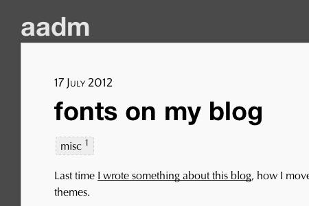
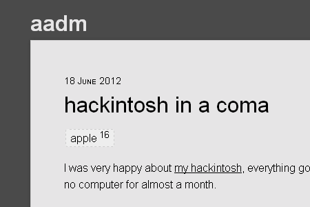
Which looked terrible on a PC though as I was using fonts that were specific to Macs:
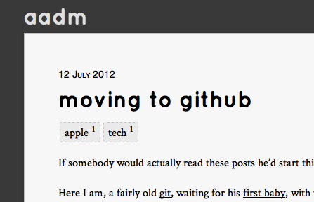
Then I tried Quicksand which I liked for the headings, together with a old-fashion Cardo:
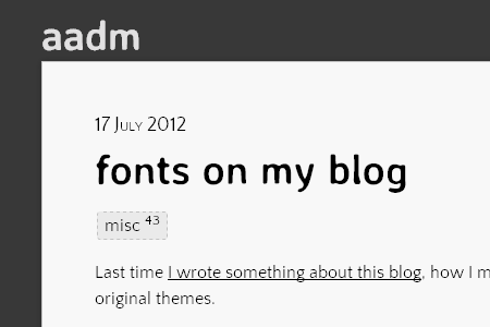
Finally I settled on Averia Sans Libre and Quattrocento Sans, plus Cousine as a fixed-width font for code paragraphs:
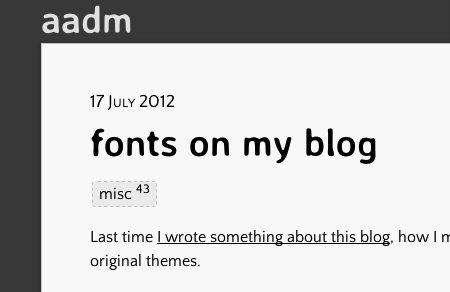
And now the site looks (almost) the same also on PC running Windows:
update August 2012
I have changed fonts once again. Now the headers are News Cycle, and the body fonts are still Quattrocento Sans (proportional) and Cousine (fixed width).